We live in interesting times in a fascinating world.
These 7 maps should give you a better idea of what's going on...
1. This map shows (in white) where 98 percent of Australia's population lives.
2. It may not come as a surprise but more people live inside the circle than outside of it.
3. Did you know you can't get Big Macs everywhere? The following map shows (in blue) the countries that don't have McDonalds.
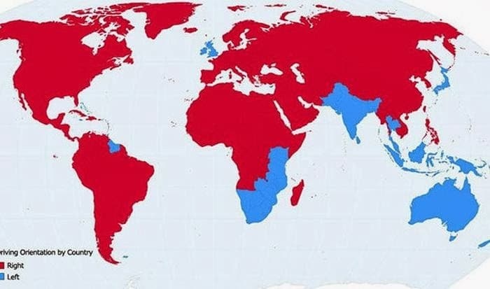
4. This map shows the countries (in blue) where people drive on the left side of the road.
5. The line in this map shows all of the world's Internet connections in 1969.
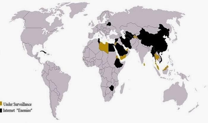
6. This map shows the countries that heavily restricted Internet access in 2013.
7. This map shows how much space the United States would occupy on the moon.


